Download gratuito di famiglia di font
STF_VON NEUHAUS
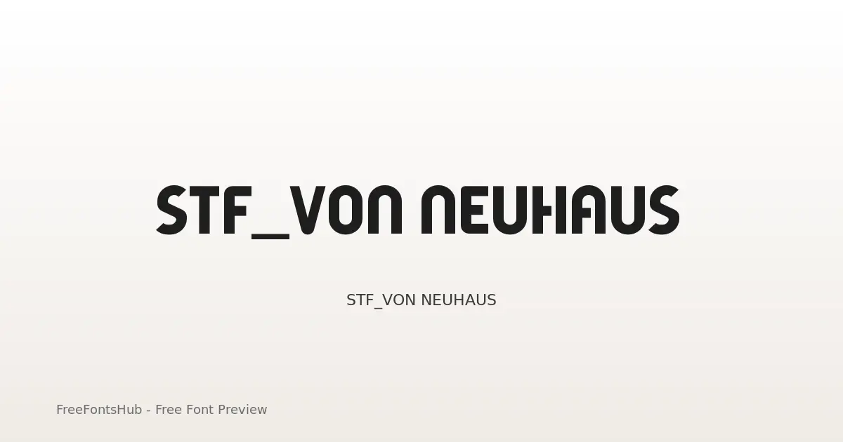
“STF_VON NEUHAUS” was built with FontStruct Designer description: <p><strong>VON NEUHAUS — </strong><em>Geometric “Bauhaus”-inspired style</em><br /> <strong>═══════════════════════════════════</strong><br /> This is the latest evolution of a <strong>“Bauhaus”</strong>-inspired constructivist style typeface design that originally started <strong>5 years</strong>, or <strong>two font versions</strong> back.<br /> To me personally this is a long awaited triumph, that has finally materialized after years worth of been haunted by this idea, and the crazy speculations about this ghost that would never be...<br /> <strong>Well, that was untill now... </strong>So at last, I can now finally proudly present to you this latest of arrivals to come from this unforeseen series of typeface progressions.<br /> This newborn addition is in fact the 3rd phase of this letter concept's evolution, and caused the font project to undergo a series of addaptations that graduatelly increasing the levels of sophistication possible by chaging it's internal structure and behaviour within the FontStruct-editor. This 3rd addaptation unlocks the FontStruct editor's<strong> “Expert Mode” </strong>full power potential.<br /> Enabling all editor functionallity to provide the most versatile font creation capabilities available within FontStruct.</p> <p><strong>STF_BLAUHAUS</strong> was the font's very first version, created back in early 2019. It's the font's original concept as it innitially was first intended. It essentially started out as a personal study into the design of letters on a small grid. And more importantly, the creation of required composite bricks to do so.<br /> The idea back then was to craft the most complex geometry possible <strong>without </strong>the use of any<strong> “Expert Mode” </strong>functionality whatsoever. Now, what this innitially did was still quite novel to me at that time, as this had led to the development of a FontStruction that was solely built from the extensive use of composite bricks. Not just a couple, but a staggering <strong>2</strong><strong>72 composite bricks in total</strong>. Many of which in fact are quite intuitive and required certain amounts of careful thinkering with the maths found in it's geomtry to craft these custom brick compositions.</p> <p>So as explained above, there was <strong>no </strong>use of any of FontStruct's <strong>“Expert Mode”</strong> functions. This meant that the option to nudge, flip or rotate any of the bricks wasn't available. Now this changes everything in respect to building complex fonts, since in order to get all the bits and pieces of a letter such as: crossbars, intersections, curves and corners properly aligned requires, a <strong>precisly fitting</strong> composite brick to be <strong>tailor-made</strong>. In terms of the FontStruct limitations, this cause the physical properties of FontStruct's brick composition tool to be fundamental as to how much complexity and refinement can be put into it's letter geometry. In other words this is fundamental as to how well crafted the design is going to look in the end, since there is no option to further manicure shape or form other than from within those bounds of the adjacent 16-brick-array grid squares of a selection for composition.</p> <p>I've choosen to design the alphabet concept in this <strong>“Bauhaus”</strong>-inspired geometric style, simply because of the simplicity this style has in terms of its basic pure geometric forms. The final result became this simple and bold looking small grid display type with a<strong> “3-bricks” Em-size</strong> only.</p> <p>but it had some crucial compromises that had to be made due to FontStruct's design limitations. Not terrible, but not quite perfect either.<br /> One very important byproduct from this limitations as were described above was a huge collection of very intuitive custom brick compositions that offer seemless alignement and perfect fits, basically an extensive set of custom bricks that work in a very similar fashion as FontStruct's default “Connect” bricks.</p> <p>Bringing us to the main reason for 2022's version of this font.<br /> <strong>STF_BLAUHAUS (Plus)</strong> was the font's second version, and most recent state that it sat in for the last year, up till this now. In this 2022 version of the of this font design modification the FontStruct editor's <strong>“Expert Mode” </strong>functionality was introduced into the design. Hoping to further manicure some of these compromised critical area's in an attempt to see what refinements could be implemented to revise the 2019's original version.</p> <p>Now that the option to nudge, flip or rotate bricks was available, new more complex geometric shapes suddenly became possible. This sparked an explosion of new characters and additional alternative forms. Although now the FontStruct editor got vastly more versatile and potent, it remained strongly limited by that still present 1:1 brick size filter setting. Nevertheless, this made possible a very substantial update of the older font, and allowed many new shaping capabilities.</p> <p><strong>STF_VON NEUHAUS </strong>is the <strong>3rd</strong> and <strong>final</strong> evolition to have come from my earlier FontStruct endeavours; <strong>STF_BLAUHAUS</strong> and <strong>STF_BLAUHAUS (Plus)</strong><br /> This version basically saw the transition<strong> from </strong>a font only using <strong>1:1</strong> brick size filter <strong>into </strong>a font at<strong> 2:2 brick size filter </strong>settings to unlock all power potential of the FontStruct editor's <strong>“Expert Mode”</strong> functions.</p> <p>I could now write another eqyually as long body of text, explaining what's new in this final version or which other improvements were made, or say about it whatever the hell I want, but I figure that the picture becomes even more apparent when simply comparing the 3 fonts from old to new, and see the evolution happening before your eyes.</p> <p>Start with<strong> STF_BLAUHAUS</strong>, folowed by<strong> STF_BLAUHAUS (Plus)</strong>, and witness the full glory of<strong> "next-level"</strong> FontStructing that made possible the last version <strong>STF_VON NEUHAUS</strong>.</p> <p>I hope you like it,</p> <p><strong>Cheers</strong></p> “STF_BLAUHAUS (Plus), which is based on “STF_BLAUHAUS
Informazioni sul font STF_VON NEUHAUS
“STF_VON NEUHAUS” was built with FontStruct Designer description: <p><strong>VON NEUHAUS — </strong><em>Geometric “Bauhaus”-inspired style</em><br /> <strong>═══════════════════════════════════</strong><br /> This is the latest evolution of a <strong>“Bauhaus”</strong>-inspired constructivist style typeface design that originally started <strong>5 years</strong>, or <strong>two font versions</strong> back.<br /> To me personally this is a long awaited triumph, that has finally materialized after years worth of been haunted by this idea, and the crazy speculations about this ghost that would never be...<br /> <strong>Well, that was untill now... </strong>So at last, I can now finally proudly present to you this latest of arrivals to come from this unforeseen series of typeface progressions.<br /> This newborn addition is in fact the 3rd phase of this letter concept's evolution, and caused the font project to undergo a series of addaptations that graduatelly increasing the levels of sophistication possible by chaging it's internal structure and behaviour within the FontStruct-editor. This 3rd addaptation unlocks the FontStruct editor's<strong> “Expert Mode” </strong>full power potential.<br /> Enabling all editor functionallity to provide the most versatile font creation capabilities available within FontStruct.</p> <p><strong>STF_BLAUHAUS</strong> was the font's very first version, created back in early 2019. It's the font's original concept as it innitially was first intended. It essentially started out as a personal study into the design of letters on a small grid. And more importantly, the creation of required composite bricks to do so.<br /> The idea back then was to craft the most complex geometry possible <strong>without </strong>the use of any<strong> “Expert Mode” </strong>functionality whatsoever. Now, what this innitially did was still quite novel to me at that time, as this had led to the development of a FontStruction that was solely built from the extensive use of composite bricks. Not just a couple, but a staggering <strong>2</strong><strong>72 composite bricks in total</strong>. Many of which in fact are quite intuitive and required certain amounts of careful thinkering with the maths found in it's geomtry to craft these custom brick compositions.</p> <p>So as explained above, there was <strong>no </strong>use of any of FontStruct's <strong>“Expert Mode”</strong> functions. This meant that the option to nudge, flip or rotate any of the bricks wasn't available. Now this changes everything in respect to building complex fonts, since in order to get all the bits and pieces of a letter such as: crossbars, intersections, curves and corners properly aligned requires, a <strong>precisly fitting</strong> composite brick to be <strong>tailor-made</strong>. In terms of the FontStruct limitations, this cause the physical properties of FontStruct's brick composition tool to be fundamental as to how much complexity and refinement can be put into it's letter geometry. In other words this is fundamental as to how well crafted the design is going to look in the end, since there is no option to further manicure shape or form other than from within those bounds of the adjacent 16-brick-array grid squares of a selection for composition.</p> <p>I've choosen to design the alphabet concept in this <strong>“Bauhaus”</strong>-inspired geometric style, simply because of the simplicity this style has in terms of its basic pure geometric forms. The final result became this simple and bold looking small grid display type with a<strong> “3-bricks” Em-size</strong> only.</p> <p>but it had some crucial compromises that had to be made due to FontStruct's design limitations. Not terrible, but not quite perfect either.<br /> One very important byproduct from this limitations as were described above was a huge collection of very intuitive custom brick compositions that offer seemless alignement and perfect fits, basically an extensive set of custom bricks that work in a very similar fashion as FontStruct's default “Connect” bricks.</p> <p>Bringing us to the main reason for 2022's version of this font.<br /> <strong>STF_BLAUHAUS (Plus)</strong> was the font's second version, and most recent state that it sat in for the last year, up till this now. In this 2022 version of the of this font design modification the FontStruct editor's <strong>“Expert Mode” </strong>functionality was introduced into the design. Hoping to further manicure some of these compromised critical area's in an attempt to see what refinements could be implemented to revise the 2019's original version.</p> <p>Now that the option to nudge, flip or rotate bricks was available, new more complex geometric shapes suddenly became possible. This sparked an explosion of new characters and additional alternative forms. Although now the FontStruct editor got vastly more versatile and potent, it remained strongly limited by that still present 1:1 brick size filter setting. Nevertheless, this made possible a very substantial update of the older font, and allowed many new shaping capabilities.</p> <p><strong>STF_VON NEUHAUS </strong>is the <strong>3rd</strong> and <strong>final</strong> evolition to have come from my earlier FontStruct endeavours; <strong>STF_BLAUHAUS</strong> and <strong>STF_BLAUHAUS (Plus)</strong><br /> This version basically saw the transition<strong> from </strong>a font only using <strong>1:1</strong> brick size filter <strong>into </strong>a font at<strong> 2:2 brick size filter </strong>settings to unlock all power potential of the FontStruct editor's <strong>“Expert Mode”</strong> functions.</p> <p>I could now write another eqyually as long body of text, explaining what's new in this final version or which other improvements were made, or say about it whatever the hell I want, but I figure that the picture becomes even more apparent when simply comparing the 3 fonts from old to new, and see the evolution happening before your eyes.</p> <p>Start with<strong> STF_BLAUHAUS</strong>, folowed by<strong> STF_BLAUHAUS (Plus)</strong>, and witness the full glory of<strong> "next-level"</strong> FontStructing that made possible the last version <strong>STF_VON NEUHAUS</strong>.</p> <p>I hope you like it,</p> <p><strong>Cheers</strong></p> “STF_BLAUHAUS (Plus), which is based on “STF_BLAUHAUS
Stili in questa famiglia: Regular. Anteprima ogni peso in questa pagina, poi scarica il pacchetto completo di STF_VON NEUHAUS.
Copyright: Copyright Sed4tives 2023 “STF_BLAUHAUS (Plus), which is based on “STF_BLAUHAUS
Marchio: FontStruct is a trademark of FontStruct.com
Stili disponibili
Anteprima di ogni pesoRegular

Usa ← → per gli stili, + − per lo zoom, scorri per ingrandire, Esc per chiudere
Come usare STF_VON NEUHAUS
- Scarica lo ZIP di STF_VON NEUHAUS (1 stile, OTF + readme).
- Decomprimi, poi installa i font desktop (TTF/OTF) su Windows, macOS o Linux.
- Per il web, preferisci WOFF2/WOFF quando inclusi; tieni TTF/OTF come fallback.
- Segui SIL Open Font License (OFL 1.1) prima di pubblicare a scopo commerciale.
Licenza e attribuzione
Licenza: SIL Open Font License (OFL 1.1) — dettagli della licenza
Creative Commons Attribution Non-commercial No Derivatives
Permesso di incorporazione: preview_and_print_only
Domande frequenti
STF_VON NEUHAUS è gratuito?
Sì, puoi scaricare STF_VON NEUHAUS gratis da questa pagina. Segui la licenza per gli usi consentiti.
Cosa è incluso nello ZIP?
Lo ZIP include tutti i file di stile disponibili per STF_VON NEUHAUS (OTF) più un readme con i dati di designer, fonderia e licenza.
Chi ha creato STF_VON NEUHAUS?
Progettato da Sed4tives / fonderia: https://fontstruct.com.
Posso usarlo a scopo commerciale?
L'uso commerciale di STF_VON NEUHAUS dipende da SIL Open Font License (OFL 1.1). Controlla la licenza in questa pagina e nello ZIP prima di progetti commerciali.