September 17, 2026 · Admin
A Deep Dive into La Luxes Font Duo: The Ultimate Luxury Typography Pairing
Elevate your design with the La Luxes Font Duo by Set Sail Studios. Explore the ultimate luxury script and serif pairing for high-end branding and typography.
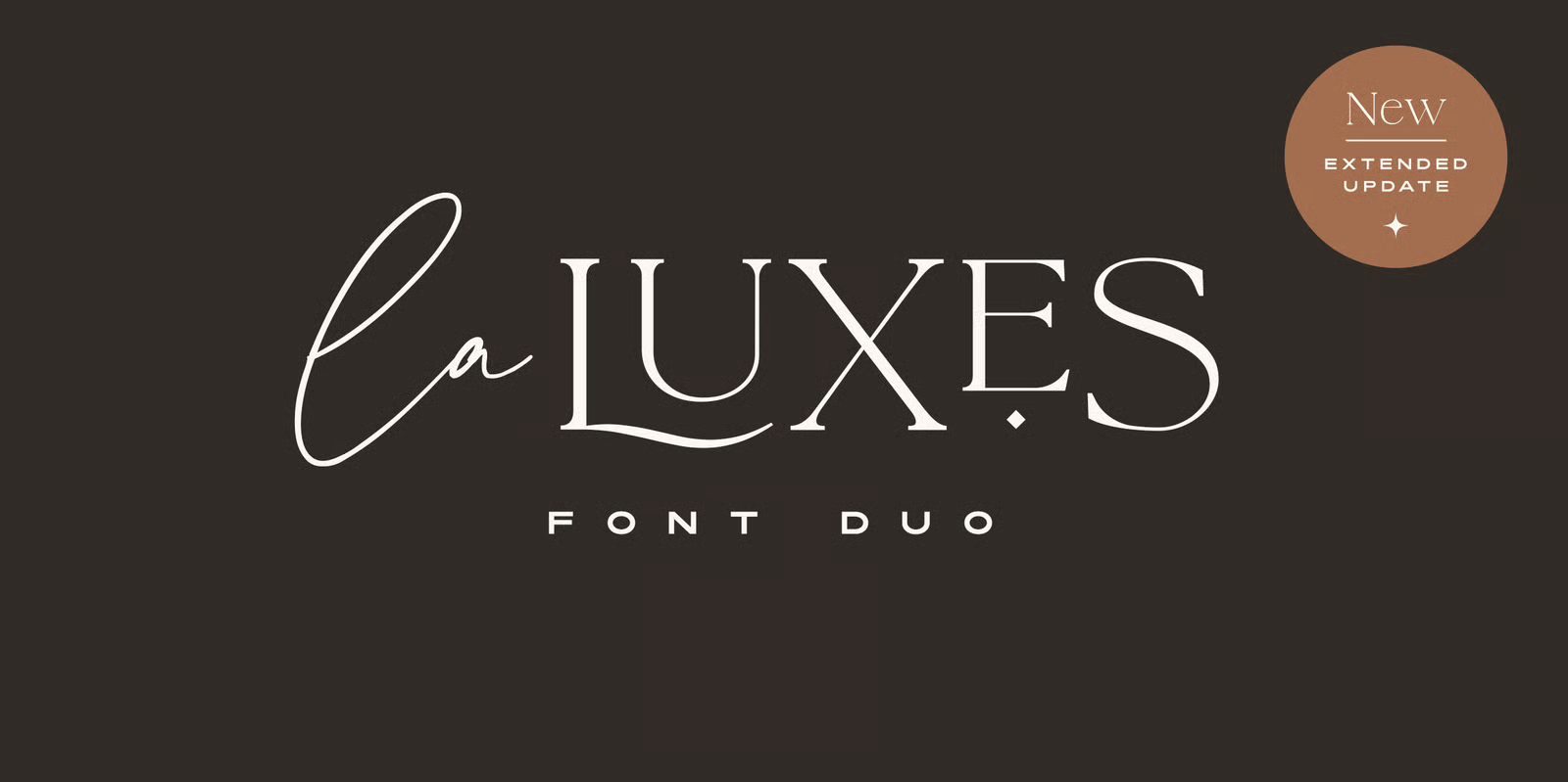
Finding the perfect font pairing can often feel like a balancing act between contrast and cohesion. Designed by Sam Parrett of Set Sail Studios, La Luxes solves this effortlessly. It is a premium font duo that combines a flowing, hand-drawn script with a highly structured, ligature-rich serif, designed specifically to lend an opulent, high-end aesthetic to design projects.
Anatomical Breakdown & Font Metadata
La Luxes isn't just visually striking; it is highly engineered with extensive OpenType features that give designers maximum layout flexibility.
1. La Luxes Serif
Originally an all-caps display serif (and recently expanded to a 12-style Pro family with lowercase letters and varying weights), the serif relies heavily on structural elegance and custom-made typographic touches.
-
Ligatures: Contains 38 unique double-letter pairings accessible via 'Discretionary Ligatures'.
-
Special Characters: Features 11 special characters, including raised 'small caps' (A, E, O, U, C) and dramatic elongated tails on specific letters (L, K, R) accessible via 'Stylistic Alternates'.
-
Technical Vibe: Crisp ascenders and descenders optimized for high legibility at large display sizes.
2. La Luxes Script
A clean, fluid script that acts as the perfect organic counterbalance to the rigid serif.
-
Flow & Spacing: Features 30 'Standard Ligatures' that should be enabled by default to ensure natural, unbroken handwriting flow.
-
Glyph Count: Robust multi-language support covering Western and Central European languages.
Best Uses in Modern Design
Because of its built-in contrast and extensive alternate glyphs, La Luxes thrives in environments that demand sophistication.
-
High-End Branding & Logos: The interplay between the script and serif makes it perfect for boutique branding. You can use the serif for the primary brand mark and the script as a supporting tagline. (Set Sail Studios even includes 10 vector logo templates with the duo to highlight this exact use case).
-
Premium Product Packaging: Whether it is artisanal cosmetics, boutique coffee roasters, or luxury apparel tags, the elongated tails and custom ligatures give packaging a bespoke, custom-lettered feel without the cost of a custom typeface.
-
Wedding & Event Stationery: The script provides the romantic, personalized touch expected in invitations, while the serif anchors the critical details (dates, venues) with perfect readability.
-
Editorial Hero Sections: For digital magazines or luxury lifestyle blogs, using La Luxes Serif for a prominent H1 tag creates instant visual hierarchy and elegance.
Web Performance & Implementation Considerations
When deploying La Luxes on the web, optimizing your font delivery is crucial to maintaining solid Core Web Vitals, particularly your Largest Contentful Paint (LCP) and Cumulative Layout Shift (CLS).
-
Format Selection: Always serve the
.woff2format in your@font-facedeclarations. It offers superior compression over standard.ttfor.otffiles, minimizing render-blocking time. -
Subsetting for Logos: If you are only using La Luxes to render a text-based logo or a specific hero headline, consider subsetting the font to include only the necessary characters. Stripping out unused multi-language glyphs and unused ligatures can drastically reduce the file size.
-
Preloading: Use
<link rel="preload" href="laluxes.woff2" as="font" type="font/woff2" crossorigin>in your document<head>to ensure the browser fetches the font file as a high priority, preventing a Flash of Unstyled Text (FOUT). -
Font-Display Swap: Implement
font-display: swap;in your CSS to ensure text remains visible while the custom font loads, keeping your layout stable and your CLS score healthy.
Final Thoughts: A Masterclass in Contrast
Ultimately, La Luxes is more than just a beautiful font pairing; it is a complete typography toolkit for luxury design. It takes the guesswork out of matching typefaces by offering an organic, flowing script that perfectly balances its structured, ligature-heavy serif counterpart.
Whether you are crafting high-end bespoke packaging, designing elegant event stationery, or building a high-performance luxury web experience (with those .woff2 files properly optimized, of course), La Luxes delivers a custom-lettered aesthetic straight out of the box.
If you are looking to elevate your next project with effortless sophistication and precise typographic control, La Luxes deserves a permanent spot in your font library.