August 16, 2026 · Admin
Serif vs. Sans-Serif Fonts – When to Use
Discover the core differences between serif and sans-serif fonts. Learn when to use each style, explore top free font examples, and find out which type best fits your design project.
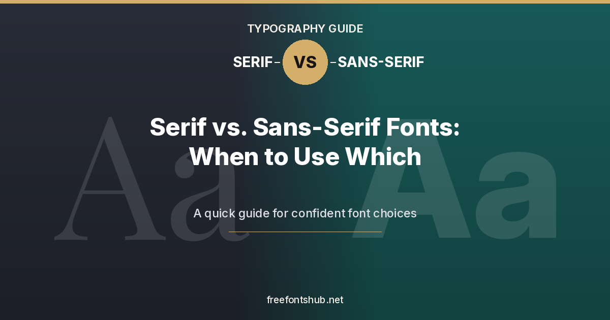
Nowadays, the font market is booming with 2 most popular and useful font types. These are called serif and sans-serif. Even though the names of both these fonts resemble each other, they are opposite to each other. Serif fonts consist of very minute strokes that make the letters meet their end very smoothly. On the other hand, sans-serif fonts consist of open-end strokes that may not give a proper climax to the letters but can prove to be bold.
In this article, we will understand more about these 2 fonts, when they should be used, some free font examples of the fonts, and the exact difference between them. At the end of the article, you may also be able to know which among the 2 fonts is better and which one you should move forward with. So, let’s begin.
Right Time to Use Serif Fonts:-
Serif fonts can be used to give the best effects in printable materials which have long-form texts to be read. Also, heritage or luxury brands may choose it as a specialized font for their graphics. Due to its reliability, sophistication, and traditional touch, even the editorial, publishing and media industry can use it. Very formal and professional invitations and certificates can also be made with the help of this font.
Some of the free examples of serif fonts are Cormorant Garamond, Playfair Display, Cinzel, Lora, and Merriweather.
Right Time to Use Sans-Serif Fonts:-
In the case of sans-serif fonts, their main use can be for signatures and wayfinding. Some other uses include startup or tech-industry branding and designs which are minimalist & contemporary.
Due to the straightforward, clean, and modern approach of this font, it can also be used in various digital interfaces and websites, which can be easily readable even on mobile screens.
Free examples of sans-serif fonts are Work Sans, Montserrat, Lato, Inter, and Poppins.
Difference Between Serif and Sans-Serif Fonts – Which is Better:-
Serif and sans-serif fonts may not sound different, but they have specific distinguishing features. These basic differences between the fonts need to be carefully considered when making your choice.
Here is a list of some differences between serif and sans-serif fonts –
-
The finishing strokes of the serif font are much more decorative and classier as compared to the sans-serif font. In fact, it can be said that a sans-serif font doesn’t have any strokes at the end of letters, and the font is very simple and clean.
-
The overall typography of the sans-serif font aligns largely with the Montserrat or Helvetica fonts. On the other hand, the typography of the serif font aligns mostly with Playfair Display or Times New Roman fonts.
-
In French, the meaning of serif is small strokes or lines and the word ‘sans’ means ‘without’. To be precise, the meaning of serif font is having small strokes or lines in the letters, while sans-serif font means missing them, which makes the letters cleaner and more geometric.
After closely understanding the above differences between serif and sans-serif fonts, it is very clear that neither is better than the other. Both these fonts run at equal pace and need to be chosen wisely according to your requirements and overall designs.
Wrap Up:-
Deciding which font among the 2 to select may seem to be a difficult choice. However, if you know exactly what you want to represent through your fonts and what the individual fonts offer, then this choice may become easier.
To begin with, you should know exactly where your content is going to be viewed, what emotion you want to convey to your audience, and what the weightage of the content is. Some other things to consider may be the platform on which you are going to post your content and what your chosen industry expects from your content. Once all these questions are answered, choosing the best among the 2 fonts becomes achievable for sure.