August 18, 2026 · Admin
Best Free Fonts for Resumes and CVs That Still Look Professional
Choosing the right font can make or break your resume. Discover top free, highly readable fonts—like Georgia, Open Sans, Calibri, Garamond, and Lato—that deliver a polished, professional look to catch any employer's eye.
Many people prepare their resume with a brilliant skillset and present it to the company in the hope of getting it approved. However, due to the use of inappropriate or unattractive fonts for their selected themes, employers may find your resume or CV boring & may cast it aside.
Therefore, it is very important to know which font you want to use and use it correctly with the theme to get effective results. This article highlights some such prominent fonts that can make your resume or CV look presentable, right at first sight.
Free Fonts that Suit Resumes & CVs the Best:-
To make your resumes and CVs look completely professional and attractive, using the following fonts will surely be very beneficial for you for sure –
-
Georgia:
To make the fonts strong and readable on screen, Georgia is specifically made with enlarged font weight. This is a classic font that can make even normal PDFs look impactful. Definitely, your resume will stand out with the help of this font, even if it is in the PDF format.
In traditional industries such as academia, law, and even finance, this font will make your resume look industry-ready and very attractive even at a single glance.
-
Open Sans:
Open Sans is a type of sans-serif font that is specially designed for legibility and cannot be moved forward without it.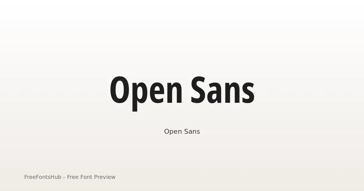
This font is best suited for both big and small screens and can perform well even on mobile phone screens.
-
Calibri:
Calibri is one of the simplest and most basic fonts used in almost all legal or important documents. Using this font in your resume will make it look simple yet powerful. The edges of the letters in this font are rounded, and this makes the text very easy to read.
This is a very traditional font that also gives some modern touches to the letters, and the range of weights in this is very vast.
-
Garamond:
Garamond font is unbeatable when it comes to getting a timeless and refined look for your text. This is a classic example of a serif font and has been used in the publishing industry for centuries now.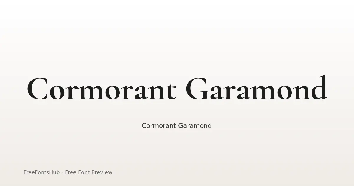
The elegance of the font is displayed very specifically with every stroke of the letters, and the overall quality of the font is also amazing. Those who want to use fonts that have almost identical metrics and appearance can go with the Garamond font without a second thought.
-
Lato:
To get a perfect balance between professional tone and warmth of human touch, using the Lato font for your CV and resumes is a great choice. Whether you are choosing to go with traditional resumes or give them a modern touch, this font will adapt to any style very fluently & flawlessly.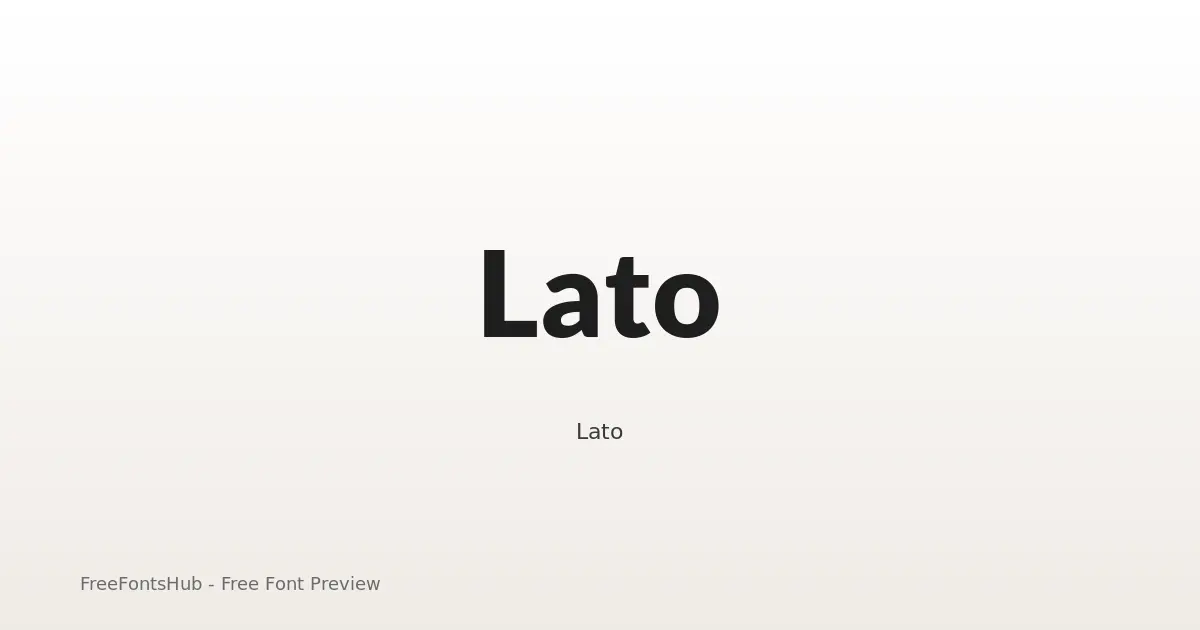
The range of weights in this font is also very high, and that is why distinguishing between the header and body becomes easier.
Apart from the above-mentioned free fonts, the list also includes fonts such as Source Sans Pro, Helvetica, Arimo, and others. So, the list of free fonts to be chosen from is huge, but making the right choice is important.
The right choice will surely come from the outline theme of the resume, available space, and courses & certifications you want to highlight in your resume or CV.
Wrap Up:-
Once you properly understand the overall structure and purpose of every font mentioned above, choosing the right one for your resume becomes easier for you.
However, one thing that you shouldn’t forget is that your resume should always stand out from the crowd. It should look so specific, on-point, and attractive that it instantly catches the attention of the employers.